Media A2 project analysis ( Evaluation)
After completing the project I have understood the combination of that the main product has with the ancillary texts. The use of the ancillary texts have enabled me to understand the requirements in order to target my audience. I have understood, through the use of empirical research that being able to engage the target audience into my main product and ancillary text is the fundamental origin to the success of an artist. I made sure that my ancillary texts had a recurring theme that linked to my video, this is important for an audience as it reinforces the meanings of the video. I believe that the combination of my main product and ancillary texts is a strong connection as I use a lot of symbolism, such as the woman’s face on the poster.
What I did try to do however, is challenge the conventions of the ideology of mainstream digi-packs. I believe it is important to create an enigma for an audience as my empirical research ( questionnaires) suggests that creating an enigma is the catalyst for the sales of a digipack and the video. When I asked my target audience , 16-25 year olds , on what they look for in a digipack , the majority ( 8 out of 10) replied “ individual”. This is reinforced through the comment by Samantha Ross,18, who said “ I like to buy something that challenges the conventions of the modern digipack, it is intriguing and offers something different from the typical product that you see on the shelf at a store”. After extracting the meanings from her comment and making sure that my target audience were viewing a product that challenged the conventions of other “typical” products ,I did believe it was important to keep some of the aspects of what makes a rock product. When I gave out my initial digipack many of my responses questioned the representation of the rock genre that was needed in the digipack. I believe that even though challenging conventions is something important in establishing an artist into the challenge of the modern music industry , it is important to make sure that you have embedded forms of the music’s genre evident in the product. This is important for the target audience to identify with. It is important for them to see what genre the video and the other ancillary tasks “fit into” otherwise they wouldn’t know which would, in consequence, result in the disinterest of the target audience.
The distribution of initial designs to my target audience has been a very beneficial process. After giving out initial designs of posters and digipacks I have understood more about the target audience, and what they engage with when looking for a product. Adam Herrick (17) commented on my sand timer design of my digi-pack commenting “ I like the symbolism of the sand timer, after looking at your video they both link strongly, I would however think about how you will produce this though as it seems a bit too difficult”. After looking at the design again and taking into account how I will create that design, it was clear that it would be too unrealistic. However, his comment was very beneficial in how the symbolism of this digi-pack and the connection it had with the music video was something that was intriguing to my target audience.
This then brings me onto the feedback analysis. I have learnt from feedback that it is crucial to constantly ask a range of people on opinions on an idea. Every design I made I asked someone from my target audience on there opinions of the design. Without the help of constant feedback on every design I wouldn’t be able to target my audience correctly. If I were to repeat the process then I may have targeted more online forums and the rock genre audience more as this would help fit my product into a niche into the market and really understand the target audience. It is important to make more use out of new media products , especially the use of the internet. It is important as it places a very important role into the marketing of the product due to the vast size of the internet. Even though soft rock music isn’t a genre that I live and breathe it has really made me understand more about this audience and there position in the music industry. This genre has made me realise, through the use of asking for feedback from the genres listeners, that the genre is comprised of a complex system of layers that formulate to create a very diverse genre with a broad categorisation.
In order to understand my target audience , I decide that it was beneficial to give my main product and ancillary texts to my target audience, 16-25 year olds and ask for there honest opinion on this initial pack of products. The first question on a sample of 10 I asked was “ Do all the products link?” What I wanted to understand from asking this question was the effectiveness of the combination of my main product and ancillary texts. I believe this is important in the marketing aspect of any music product so that it enables the audience to relate one product to another and to identify one part of the project to another. The pie chart to the left illustrates the target audiences response to the question with eight out of 10 of the audience replying to yes, whilst only two of them said no. I was very pleased with the result of the answer as it was a very high percentage however I did want to find out reasons as to why the two participants replied “no”. Both responses were “ the colours and the standardised layout looked like an R&B album” this therefore I needed to change.
In order to overcome this problem, I decided it was important to develop the conventions of the rock genre instead of try to challenge them. This would solve the problem as the audience would more easily be able to identify the genre of the project easier. I did later return to the two participants who agreed that the change was more appropriate , James Goodman (18) commented “ The colours are more rock appropriate” this reinforces the significance of audience feedback in the creation of a product. Another way in which my media product develops the conventions of other real media products was through the creation of the poster. After researching about controversial videos and the effect it had on the audience, it was obvious that creating a controversial product had a high possibility of creating a hype, the demand for more.
Once I attained this understanding, I decided to create a controversial poster as I felt that this would be a good marketing strategy to aid the audiences intrigue for the video. I made the poster by drawing out my image with headlines scattered around the face. Once I did this I then scanned the image and edited it on Photoshop. I made use out of the scanner in this part of the project but I also made use of empirical research of news paper headlines. I decided in order to express the posters depiction of society, I decided to get newspaper headlines. I looked through “Daily-Mail” “The Sun” and “The Guardian” for a variety of headlines. It wasn’t very time consuming and it the response from my target audience seemed very positive, Danielle Martin 18 commented “ The planning for this is clear, the recent headlines grab my attention and make me want to read them and see more”. After scanning the image into Photoshop, I then edited the image using the bucket tool and then did general moving of texts. I found that the use of Photoshop from last years project was very beneficial as it was all applicable to this years project. Because I learnt last year how to use Photoshop it saved me a lot of time as well. I used quite a feminine colour for the background of my poster, simply to illustrate the contrast of the innocence of the colour with the reality that was on the poster e.g. “ mass murder”. I believe that the use of the colour is symbolic to the meanings of the poster, a depiction of how society , through it’s various institutions, blankets the issues in contemporary society, this therefore is why I felt the headlines would be a powerful image for the poster as it challenges the conventions of other contemporary posters.
I used a variety of media technologies in the construction of the project. At the very beginning of the project we used cameras to take pictures of a variety of necessary shots. I enjoyed learning about the use of these shots which really did help in the shooting of the video. I was able to apply last years work on camera shots as well which helped create a more professional finish to the video due to this variety. Obviously, the editing of the video needed to use an editing programme on a computer. We learnt how to use final cut pro in more detail this year however I did apply a lot of the techniques taught last year as well. I do feel that learning this in advance ( especially from last years project) enabled me challenge my capabilities using the programme. If I were to do the project again then I would certainly take more advantage of the variety of websites offering tutorials on how to get professional effects. In order to gain an understanding, I planned in advance to gain empirical research into how to use final cut pro at an even greater level, tutorials I found on Google, even such as www.apple.com enabled me to use the system more efficiently and saved me time. The only problems we did have was how long the editing process actually was, it was only thanks to having planned the project, including the editing beforehand that we were able to complete the project on time therefore planning is crucial to the completion of the project.
The planning of the video I found was crucial in order to gather our actors and film in the locations we wanted. The use of a project diary as well as the project planner, both using the computer enabled us to work efficiently. Many times our actors couldn’t film due to personal circumstances but with the help of our plan, we were able to consider filming other shots instead, to save time. One of the only problems we had was the delivery of the sand timer which is the key symbol used in the video. The sand timer did take longer than anticipated to arrive after I ordered it online. The way we got around this problem was that Samantha ( project partner) borrowed someone else’s, although our planning was very good this is something we overlooked and for next time would change. The symbolism of the sand timer as representing “ Times significance in the transgression of a relationship” is conventionally challenging. After researching a variety of videos before we began , we didn’t notice the intrinsic use of a symbol through a whole music video and we wanted to change this. We collectively drew upon ideas and decided that the sand timer would represent what our music video was portraying very well. We used the green screen throughout the shots of the sand timer as it had clarity to the grains of sand and gave it more of a professional tone. The learning of different camera shots was certainly applicable here as we used an establishing shot with many extreme close ups of the sand timer, as a means to illustrate the importance of the sand timer as a symbol.
We decided to edit the majority of the film black and white from the very beginning of the project. We believed that doing so would develop the conventions of contemporary music videos as it would serve to present how music videos should usually be individual and that don’t have to follow the set trajectories of the codes and convention that the mass of the industry follow. We both felt that having it in black and white would engage our target audience greater. We felt that it would do this as conventionally rock videos use a lot of darker colours in there videos, so we decided to develop this by using black and white. What we found from asking our target audience is that the identification of the genre is important, James Root (18) said “ If I watch a music video online and I’m not sure of the genre the music fits into, then I usually click to something else straight away” The use of the black and white therefore is used to re-illustrate the identification of the videos genre to our audience.
The importance of planning was crucial in the production of the main product and ancillary texts. Evidence of this was the shooting of the train at the train station. We needed a shot of the train to establish where the actor was to the audience. The understanding of the role and the use of new media in the various stages of the production was explicitly evident here. Before we shot the scene at the train station we planned out the times of the trains using www.nationalrail.com to make sure that we had a train in the shot. Without the planning and without the use of the internet, it would have been unlikely that we would have captured the train shot which would have resulted in a loss of time. Other problems we had when shooting was the unreliability of the weather. We planned everything , even including the weather for the days of shooting ( http://www.weatheronline.co.uk/) however, they the weather was unreliable. A lot of time was wastes due to the unpredictability of the weather although one of the props was coats which was fortunate.
The next thing I did was comprise various ideas for the digipack. What I wanted to do was develop the conventions of a digipack to create an enigma for the target audience. I created many designs and gave them out to my target audience to get their opinions and personal feedback on the designs. I created many ideas but gave two out to the target audience, these were my best ideas. I asked fifteen people on their verdict and found that 11 out of 15 preferred the second one. Obviously this is a very big difference so I chose the second one as those I asked were participants of my target audience , therefore if they liked it then I was targeting my intended audience.
After considering what a participant said earlier about the necessity for bright colours in order to target this audience, I decided on a contrasting bright colour design. I decided to do this as it is would make a great combination to my main product as well with the other ancillary texts. The use of bright colours targets the audience better, and after researching about this genre, it is an aspect that would appeal t it’s target audience.
I looked at various designs as well and many of the best ones had four sides on them , so I decided to go with that layout. As previously mentioned I did create the digipack on Photoshop as I did have previous experience with the help of last years project. I did struggle on the digipack as each section needed to be appealing and have a recurring theme throughout. I had to take into consideration the texts as well which is black and white. I decided on black and white text as it links to the black and white in the video, my main product. What I found the hardest part of producing the digipack was the layout as I kept wanting to alter it every so often. In order to overcome this I decided to give out an initial dig pack design to my target audience. I asked five random individuals that are all in the target audience’s age group, on their opinion. Rosie Ellison, 18 commented ; “ I like the images used but the colours could be brighter” , this was also mentioned by Tom Featherstone who commented “The colour could be enhanced”. With this understanding, I then created a final digipack. I used a camera to take shots of the subject and used what I learnt on camera shots at the beginning of the project to help. The shots all created an enigma as I deliberately used creative shots to create intrigue. The audience feedback was also very effective here as I changed the colour scheme of my design in order to engage my target audience greater. The construction of the digipack was simple as I used an online template of the measurements needed.
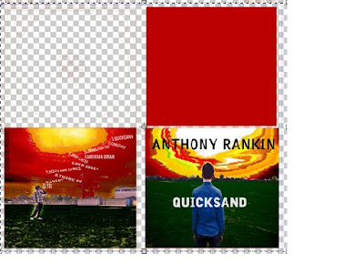
The front cover of the digipack is the back of a body looking into the distance. I believe that the front cover breaks the conventions of other modern covers as integrates two shots , a mid shot of the back of the body and also a wide shot of the setting. As mentioned previously, breaking conventions is one way of attaining the target audiences attention. The next side I did was the inside, behind the front cover. I cut out the face of another participant and then spread a line from the videos song “Quicksand” around the image. I did this as it creates a curiosity and I believe that from an audiences perspective, it would make them want to view the video and understand the meanings behind the image, that being the girl as a representation of the loneliness of the girl in the narrative of the video.
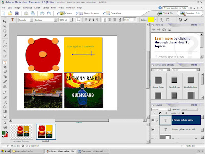
The next side that I did was the disk insert template. This was very simple to construct as the digipack template already had the disk insert template as one of the sections. I simply used my knowledge of the programme from last years final project to enable me to colour in this area. The final part that I constructed was the back cover. I personally believe that my back cover challenges the conventions of the common ideology inherent in the modern digpack market. It challenges the conventions through the use of abstract bold colours that contrasts to what is on the market at the moment, which I believe is important for creating interest to the target audience. Because I had a recurring theme of colour, it was similar to making the front cover.
In conclusion the project has enabled me to understand greater the significance of using audience feedback as it helps develop the product to make it more suitable for the target audience. I have been able to develop my skills and have been able to use skills from last years project as a means to help meet the deadline of the course. I have also realised the significance of the role of new media in the various stages of the production, the ability to research how to use programmes and how to create certain effects. I believe that the creation of ancillary texts has been the catalyst in the development of my skills and these learnt have certainly been applicable in the creation of my main product.
Thursday, 6 May 2010
Final and Initial poster
I have made the changes that my target audience suggested : Samantha Ross " The colours are perfect".
Emma Fosher " The poster fits the music genre well"
James Hann " The text works well"
Tom Featherstone " It targets the target audience"
Emma Fosher " The poster fits the music genre well"
James Hann " The text works well"
Tom Featherstone " It targets the target audience"
I decided to get target audience feedback on my initial poster, to improve for my final poster.
Samantha Ross " I like the striking image, but not the colour"
Emma Fosher"The text is too small"
James Hann " The image is great as it is detailed, the colour isn't"
INITIAL DIGI-PACK
I decided to distribute my initial digi-pack to gain a further insight into the perspectives of my target audience.
Questionnaire analysis
I asked asked a sample of 20 people , half selected and half random to evaluate my digi-pack in order to get audience feedback. I decided to ask 10 selected as I wanted at least a few from then sample to have watched my music video in which the digi-pack goes into connection with in-order to enable an evaluation that contextualised the digi-pack in relation to the music video. I have made sure that the analysis was of the initial design of my digi-pack as I want to take into consideration the changes the audience have advised as in consequence this should improve my final design.
The first question on the questionnaire was; In relation to your first glance of the digi-pack did it engage you and capture your attention?
Seventeen of the 20 people I asked said that they like it which is a huge percentage, the other 3 said “yes it was”. This is important to have an engaging elements to the digi-pack as for the cd to make any impact on the market is needs to look different and stand out. Also the people I asked were in the target audience age range, it was important for me to constantly remember the target audience and to make sure it captures there attention as it is targeted for them.
The second question was ; Do you like the colour used? 3 of the sample said it “suited very well” , 11 said it was “appropriate” and the other 6 said “not very” . This is a little alarming but good that I now know that the target audience aren’t completely fond of the colour scheme. With this knowledge I can now change the colour scheme to therefore make it more appealing to my target audience. A Danielle Martin commented “ I like how it is very different from what is already in shops however, the colours are too bright which looses some of the effect of the digi-pack”. James Hann also commented “ I didn’t like the use of too many colours, it deters away from the simplicity of the design.
The third question ;For those who watched the music video, does it work well? ( obviously please note that those who answered had watched the music video.
Fifteen out of the twenty said “yes it works well” whilst the rest said it to be “appropriate” I was curious as to why so many people believed the music video and the digi-pack worked well together. I deliberately made the digi pack as a symbolism to shape the meanings presented in the video. I noticed a lot of the target audience noticed this as well , Jade Mayhew said “ There is a clear connection between the meanings in the video and the ones presented on the CD , it even adds more to the symbol of the character” Her comment illustrates how I am trying to express the symbolism of the woman described in other parts of my planning, I am pleased that the audience understands the reason for the design of my digi-pack as I was concerned that I may have to change the idea.
The fourth question: Do all four parts of the digi-pack work in connection with one another?
Twelve said that “it’s not great” five said “ it needs changing” and the other three said “it’s appropriate. This is certainly an area for development as a clear high percentage of the target audience didn’t feel that the all the digi-pack worked together. Samantha Ross commented “ The digi-pack needs consistence and the same look on each of the parts of the digi-pack, this element needs improving” . After researching other digi-packs it is clear that the best ones inherently all carried the same theme on all of the parts of the digi-pack , I possibly may need to change this to make it all look similar , or , make it obvious that I’m breaking a convention by not following the trajectories of contemporary digi-packs.
The final question is possibly the most important out of the five questions as it addresses the fundamental objectives of the project ; “ The audience are young adults 18-25 , do you believe the cover is appropriate for this target audience?”
Sixteen of the audience said “Yes very” whilst the rest of them said “suitable”. This is a very good result where the majority thought the cover is appropriate for the target audience. I am very pleased with this result as it is therefore evident that I have engaged the target audience. Joel Watkins- Grove commented “ it is simple which attracts a good range of people.
After getting feedback on my initial digi-pack,I have enough feedback to change my digi-pack to make it more engaging. I need to change some of the design on the back and the colour scheme however, even with these changes, it is evident from the target audiences feedback that the digi-pack is engaging to its target audience.
Questionnaire for Initial “Quicksand” digi-pack
In relation to your first glance of the digi-pack did it engage you and capture your attention?
( please tick appropriate)
Yes it was very engaging
Yes it was
Not very
Needs improvement
Do you like the colour used?
Yes they it suited it very well
Appropriate
Not very
Needs more consideration
For those who watched the music video, does it work well?
Yes it works well
Appropriate
Not very
Doesn’t fit at all
Do all four parts of the digi-pack work in connection with one another?
Yes they all work together well
It’s appropriate
Not great
Needs changing
The audience are young adults 18-25 , do you believe the cover is appropriate for the age group?
Yes very
Suitable
It doesn’t suit the age very well
Very unsuitable
Construction of the Digi-pack
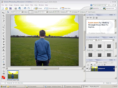
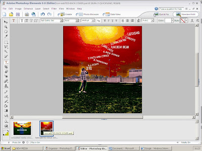
In order to edit my image to use for my Digi-pack front cover, I needed to open up Photoshop;
1.Go to start
2.All programs
3.Adobe Photoshop Elements 3.0
4.File-open
5.Then open image and begin.
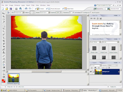
I then went to “The paint bucket” tool on the left hand side, the toolbar. After doing this I then selected the colour appropriate for the changing sky on my cover.
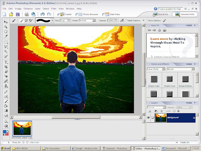
.I decided to use reds, oranges and yellows. Obviously these are all associated with the colour of the sun however, I believed the colours had many significant connotations that illustrated the meanings of the video and the Digi-pack in general.
I then continiued with the bucket too create this desire effect.
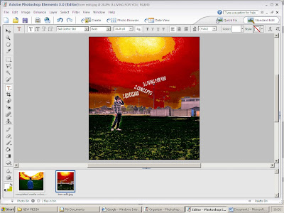
I then inserted my text. I used a white colour to make the text stand out to the audience. The effect of this enables the interest of the taregt audience.
I then continued to insert the titles of each single onto the backcover. I decided on the text to look like the lyrics were coming from the subjects' mouth as this expresses the emotion in the video; how the actors feel trapped, wanting to shout out their feelings.
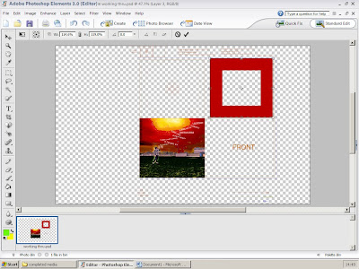
I first went to file-insert-pictures and inserted my backcover in first. I wanted to orientate the rest of the colours around the colours on the back. In order to do this I felt that inserting the back cover was important first I then continues colouring in the first inside of the digi-pack using the bucket tool on the left hand pannel. I then inserted the front cover I then used the bucket tool to colour in the disk insert. I chose red and orange colours to enable a coherent colour effect.
Completed front cover and back cover
-This is my finished Digi-pack. I am pleased with the overall design of the cover as the use of imagery captures the meanings of the video and does have a unique quality in comparison to my market research.
It was harder than I did expect it to be but the finish of the Digi-pack is very good.
The creation of the digi-pack
To open Photoshop correctly I opened the programme and then went to file-open.
I used the bucket tool to create the colours of the front cover of the digi-pack. The use of abstract colours was chosen as it breaks the conventions of contemporary digi-packs, this therefore creating an audience appeal
Andrew Goodwins' theory in connection to the target audience
Andrew Goodwin has identified a number of key features which distinguish the music video as a form. - “There is a relationship between the lyrics and the visuals”
Andrew Goodwin means how the visuals illustrate, amplifying or contradict the lyrics. This reinforces to the audience the meanings that the video is trying to stress, the visuals reinforce what the lyrics are saying , this therefore further illustrating to the audience the message of the song.- “Genres are complex and diverse in terms of music video style and iconography”.
This means that music videos can capture the essence of a certain historical or contemporary event which depicts it through the use of a complex system of visuals. The formulation of some music videos may be considered “iconic” due to the provocative content of music videos. The effect of complex genres engages the audience as it serves to intrigue the audience.
- “Record companies will demand a lot of close-ups of the main artist or vocalist.”
Record companies have many close-ups of the main artist or vocalist as it enables the audience to know the image of the artist/s. This is important for the audience as the effect of the close-ups could create connotations for an audience, and enables the audience to realise the band in terms of promotion. - “Voyeurism is present in many music videos, especially in the treatment of females, but also in terms of systems of looking. Some examples are screens within screens, cameras, mirrors, etc.”
This contextualises Laura Mulvey’s “male Gaze” theory as described in my other work. How a form of voyeurism ( a perversion in which a person receives gratification from the secretive view of a person) engages an audience is the secretiveness associated with the term where the audience may feel that they are seeing a certain view of something that others wouldn’t. “There are likely to be intertextual references, either to other music videos or to films and TV texts”
The use of intertextual references embeds and shapes meanings presented in the music video. The use of intertextual references creates further gratification as ,due to the genre of the video, the intertextuality is of the same genre, therefore pleasing the audience.
Subscribe to:
Posts (Atom)